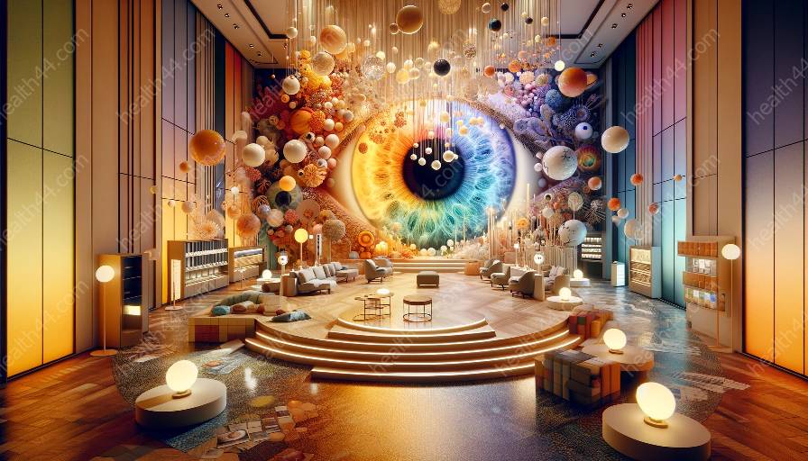
Creating spaces that are inclusive for individuals with varying color perception and vision requires thoughtful design and consideration. In this comprehensive topic cluster, we delve into the importance of accommodating color vision needs and providing user-friendly environments.
The Importance of Inclusive Environments for Color Perception
Color perception plays a crucial role in how individuals experience and interact with their surroundings. For individuals with color vision deficiencies or impairments, the design of environments can significantly impact their quality of life and experiences. Inclusive design practices strive to create spaces that are accessible and welcoming for everyone, including those with unique color perception needs.
Understanding Color Perception and Vision
Before delving into the design aspects, it's essential to understand the complexities of color perception and vision. Color vision deficiencies, commonly known as color blindness, can manifest in various forms, affecting how individuals perceive and distinguish between different colors. By understanding the specific challenges individuals with color vision deficiencies face, designers can tailor their approaches to create more accommodating environments.
Accommodating Color Vision Needs in Design
Accommodating color vision needs in design involves employing strategies that enhance usability and accessibility for individuals with varying color perception abilities. These strategies may include using high-contrast color schemes, incorporating tactile and textural cues, and providing alternative methods for conveying critical information that does not rely solely on color.
High-Contrast Color Schemes
Utilizing high-contrast color schemes can aid individuals with color vision deficiencies in distinguishing between different elements within a space. By incorporating adequate color contrast, designers can ensure that important features, such as signage and wayfinding cues, are clearly visible and discernible for all individuals.
Tactile and Textural Cues
Integrating tactile and textural cues alongside color-based information can enhance accessibility and inclusivity. For example, incorporating raised tactile markers in addition to color-coded paths within a building or public space can provide clear navigation for individuals with color vision impairments.
Alternative Information Conveyance
Providing alternative methods for conveying essential information that do not rely solely on color can significantly improve inclusivity. Utilizing symbols, icons, or textual descriptions alongside color-coding ensures that information is accessible and comprehensible for individuals with diverse color perception abilities.
User-Friendly and Accessible Environments
Creating user-friendly and accessible environments goes beyond addressing color perception needs; it encompasses a holistic approach to design that considers various sensory and mobility requirements. By prioritizing universal design principles, such as clear wayfinding, ergonomic layouts, and thoughtful lighting, designers can ensure that the built environment is welcoming and functional for all individuals.
Case Studies in Inclusive Design
Exploring real-world examples of inclusive design for color perception and vision can provide valuable insights and inspiration for designers. Case studies that highlight successful integration of inclusive design practices, such as public transportation systems, educational facilities, and public parks, can offer practical applications and best practices for creating inclusive environments.
Conclusion
Designing inclusive environments for color perception and vision is a vital aspect of creating accessible spaces that cater to the diverse needs of individuals. By understanding and accommodating color vision needs, designers can contribute to the creation of welcoming and inclusive environments that prioritize accessibility and usability for all.


